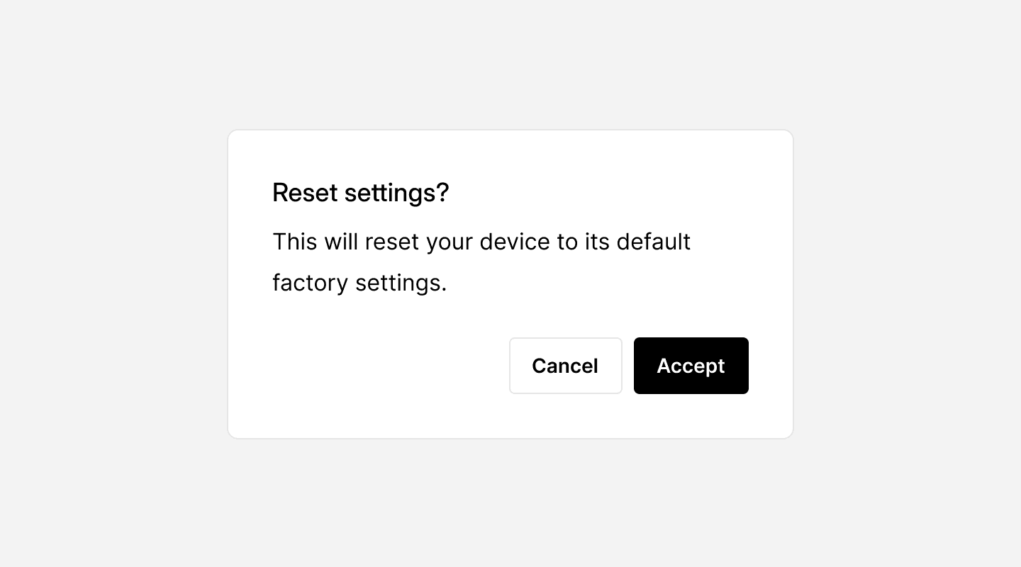
A well-designed dialog should be focused, concise, and purposeful, guiding users toward a decision without causing unnecessary friction.
When to use
✅ Confirming critical actions
✅ Requesting user input
✅ Providing important alerts
✅ Displaying additional details
When not to use
⛔️ For minor notifications
⛔️ To replace standard navigation
⛔️ If users need background context
Best practices for usability
Keep it concise – Users should be able to understand the message in seconds.
Use clear action buttons – The primary action (e.g., “
Confirm”) should be distinct, while secondary actions (“Cancel”) should be more subtle.Prevent background interaction – Users should not be able to interact with elements outside the dialog.
Ensure easy dismissal – Users should be able to close dialogs using:
The
Escape keyA
close buttonClicking outside the dialog (for non-critical dialogs)
Accessibility considerations
Keyboard Support – Users should navigate using the
Tab keyand close the dialog withEscape.Focus Management – When a dialog opens, focus should move to the first interactive element inside.
ARIA Attributes – Use
role="dialog"andaria-labelledbyfor screen reader support.
Continue reading
Looking to contribute?
Your input matters! Whether it’s feedback, design suggestions, or new ideas, every contribution helps shape a more refined, flexible, and efficient design system. Share your thoughts and be part of building something better for everyone.